A fresh, dynamic app rebrand for baseball fans of all kinds.
Duration: September 2024–present
Tools: Figma, Photoshop
Role: Senior Product Designer
Overview: As part of a larger league-wide rebrand, the MLB Ballpark app got a new look and feel for the 2025 baseball season. The goal for this was to unify all products in MLB’s product ecosystem and create a stronger brand identity and visual impact for the MLB Ballpark iOS and Android app.
Where were we before
The old MLB Ballpark app was a disjointed experience that lacked visual impact and a strong brand recognition. Its user interface, experience, and brand identity felt outdated and didn’t reflect the scale of the product or expectations of modern baseball fans.
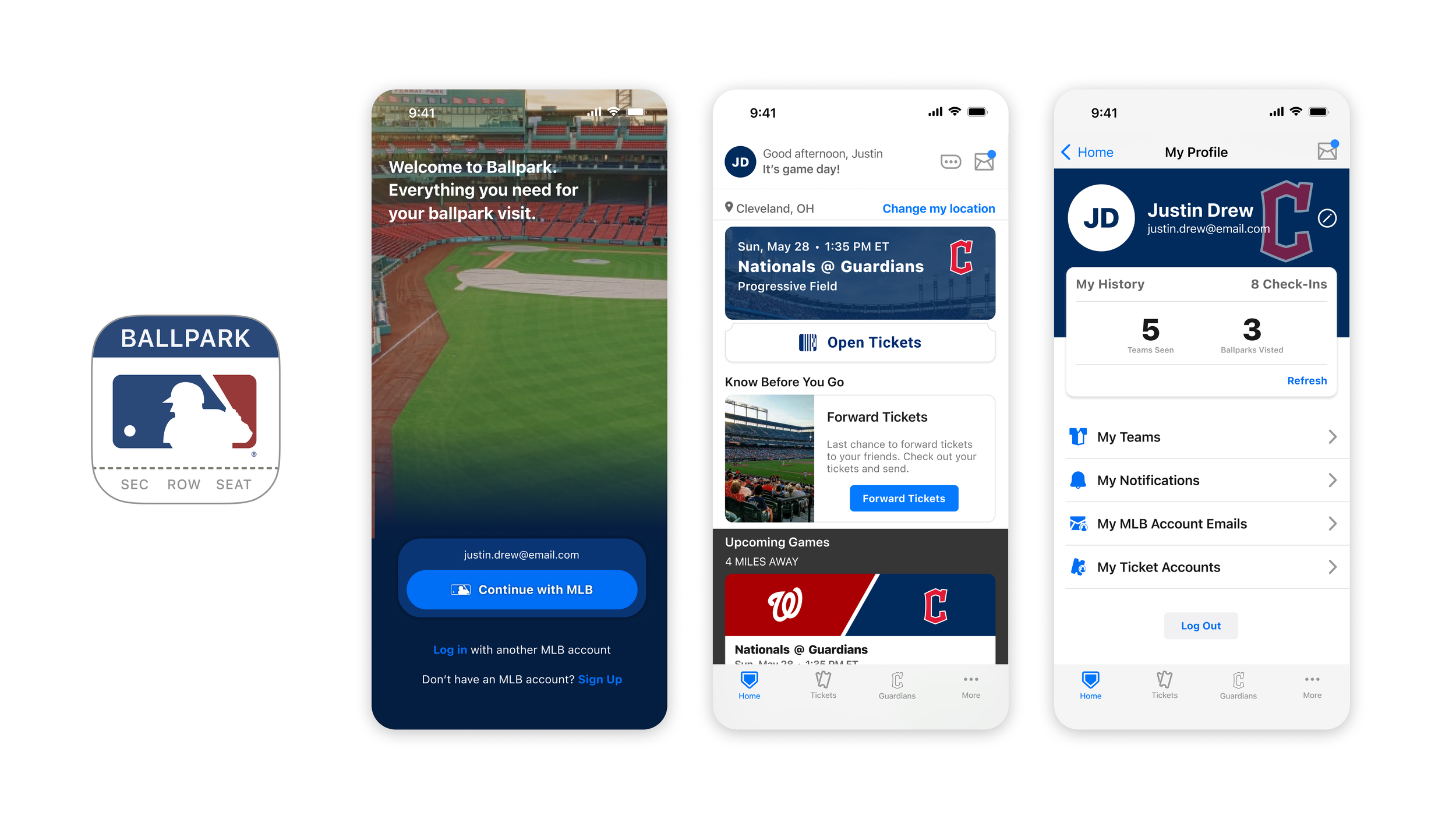
Justin Bieber said it best. Old Ballpark was not clocking to anyone.
It was difficult to use, and fans on both the App Store and Play Store weren’t shy about how frustrated they were with the experience.

Where we landed
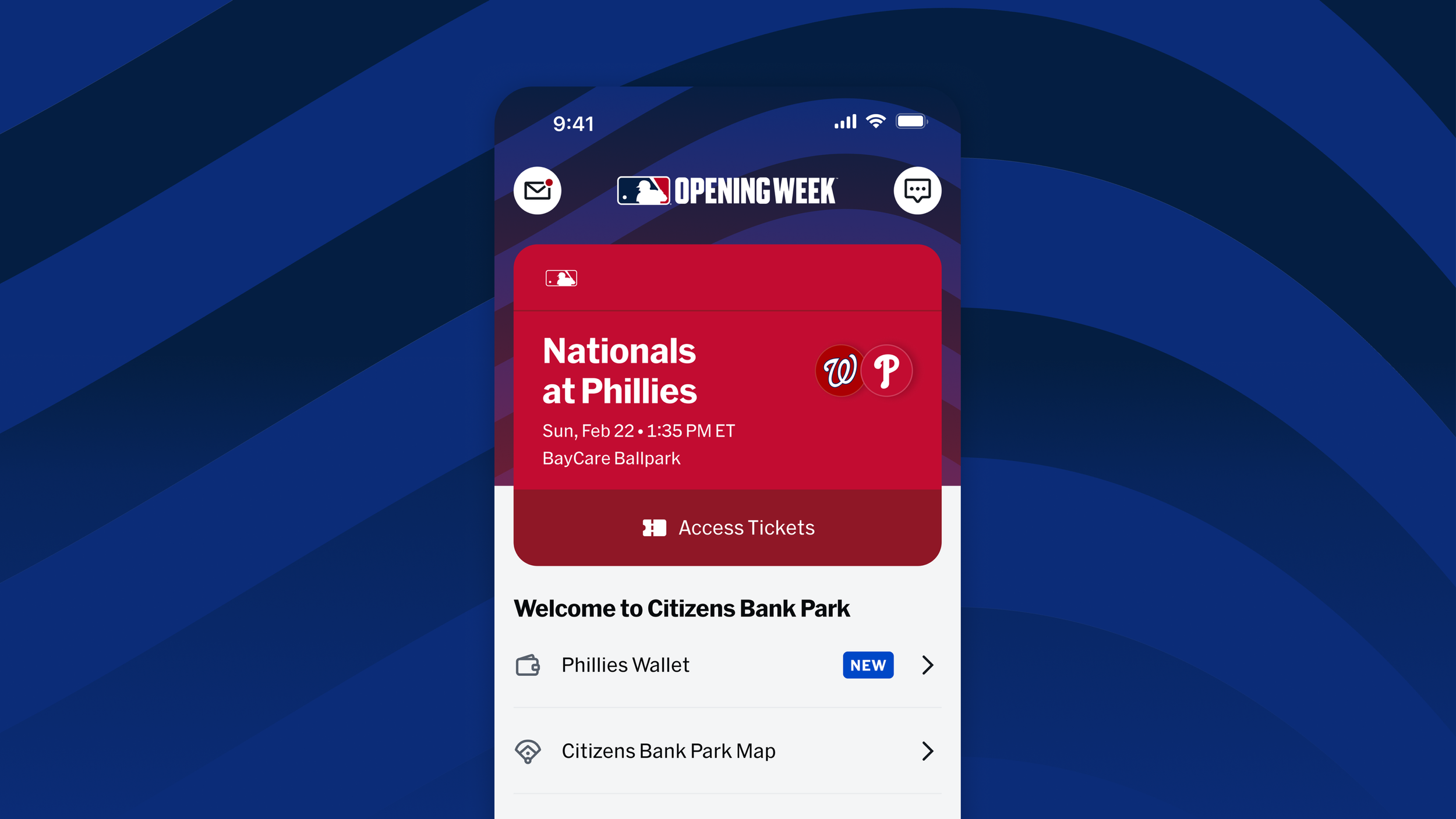
For the 2025 season, we were committed to giving fans a fresh, unified app experience that was easier to use, aligned with the rest of the products in MLB’s ecosystem, and most importantly, felt uniquely baseball.
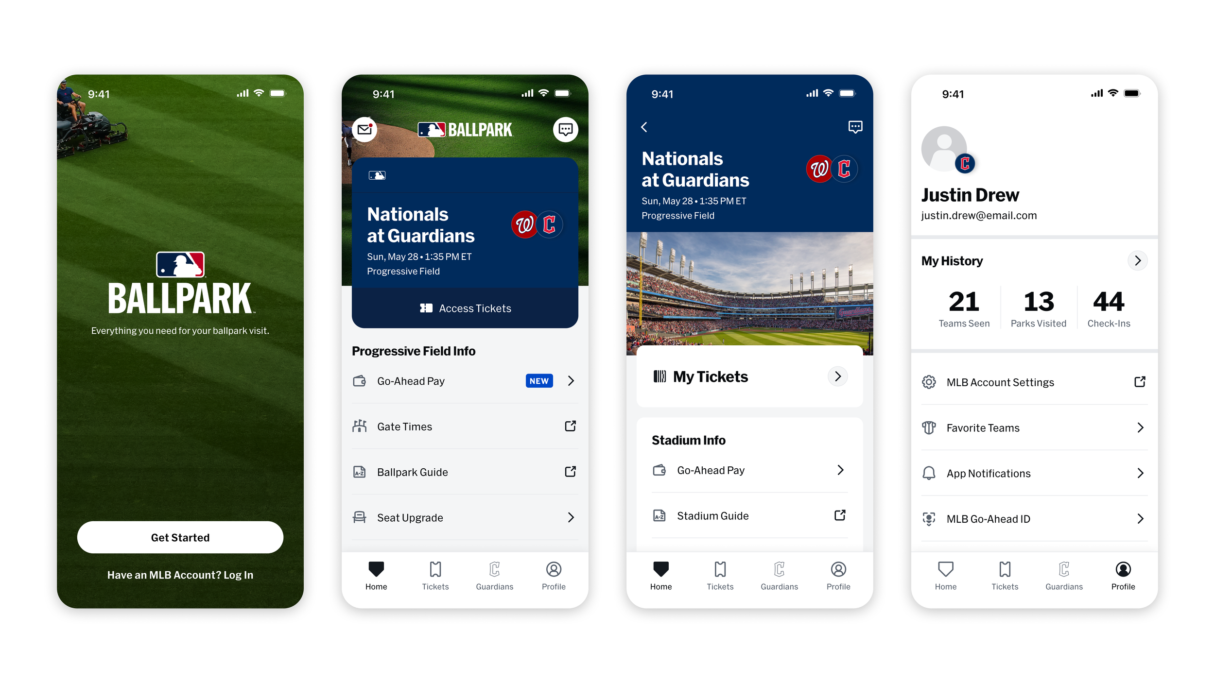
The Home Tab in particular was aimed to create a more contextual experience that met fans where they were in their journey – before, during, and after game day.
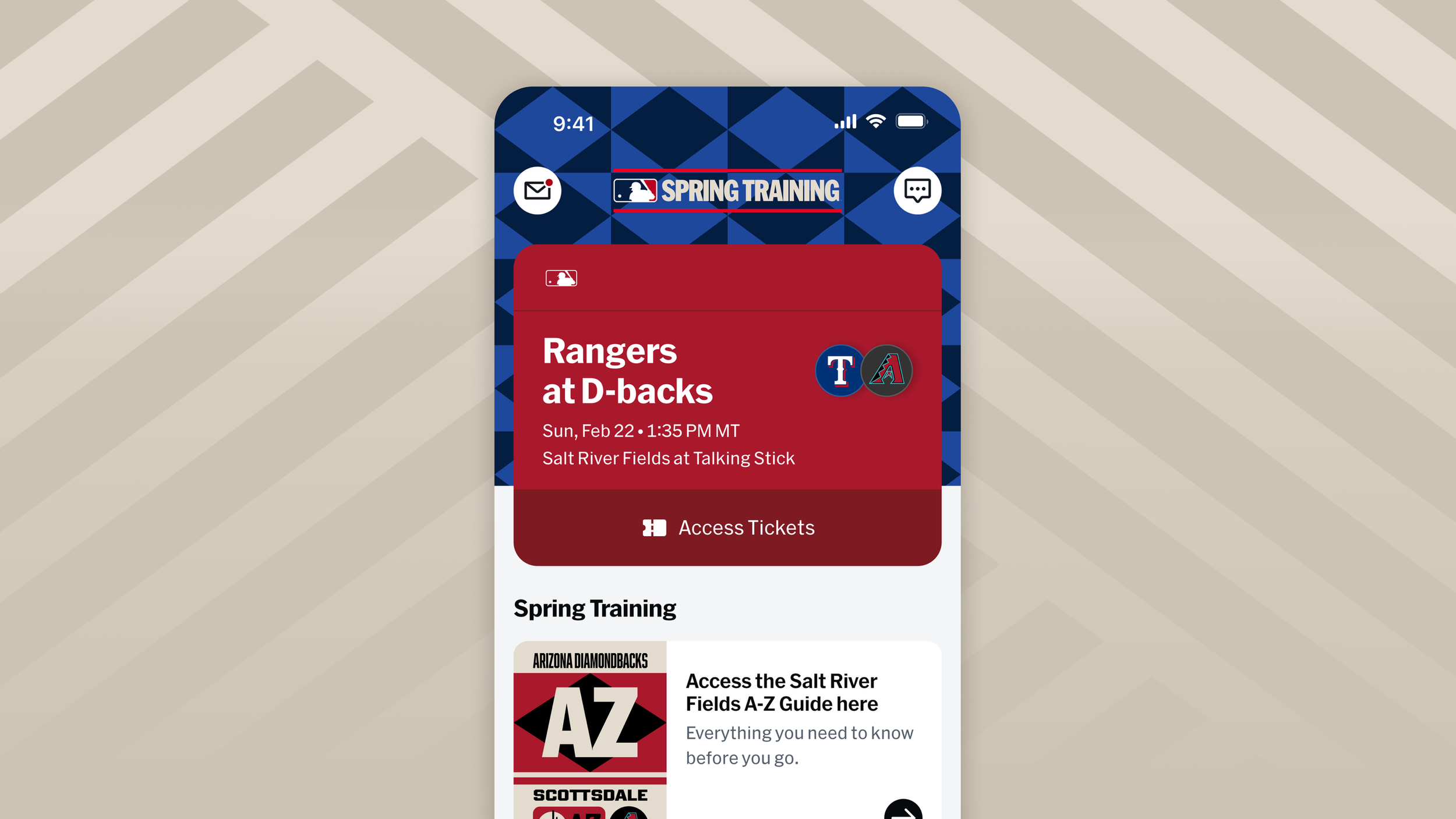
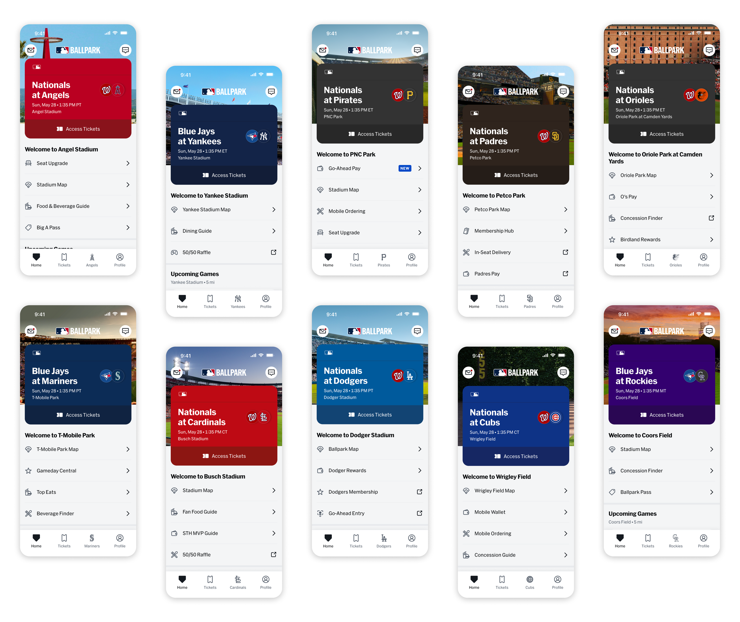
For the 2026 season, we introduced localized imagery that further immerses fans in the unique environments of the ballpark they’re visiting.
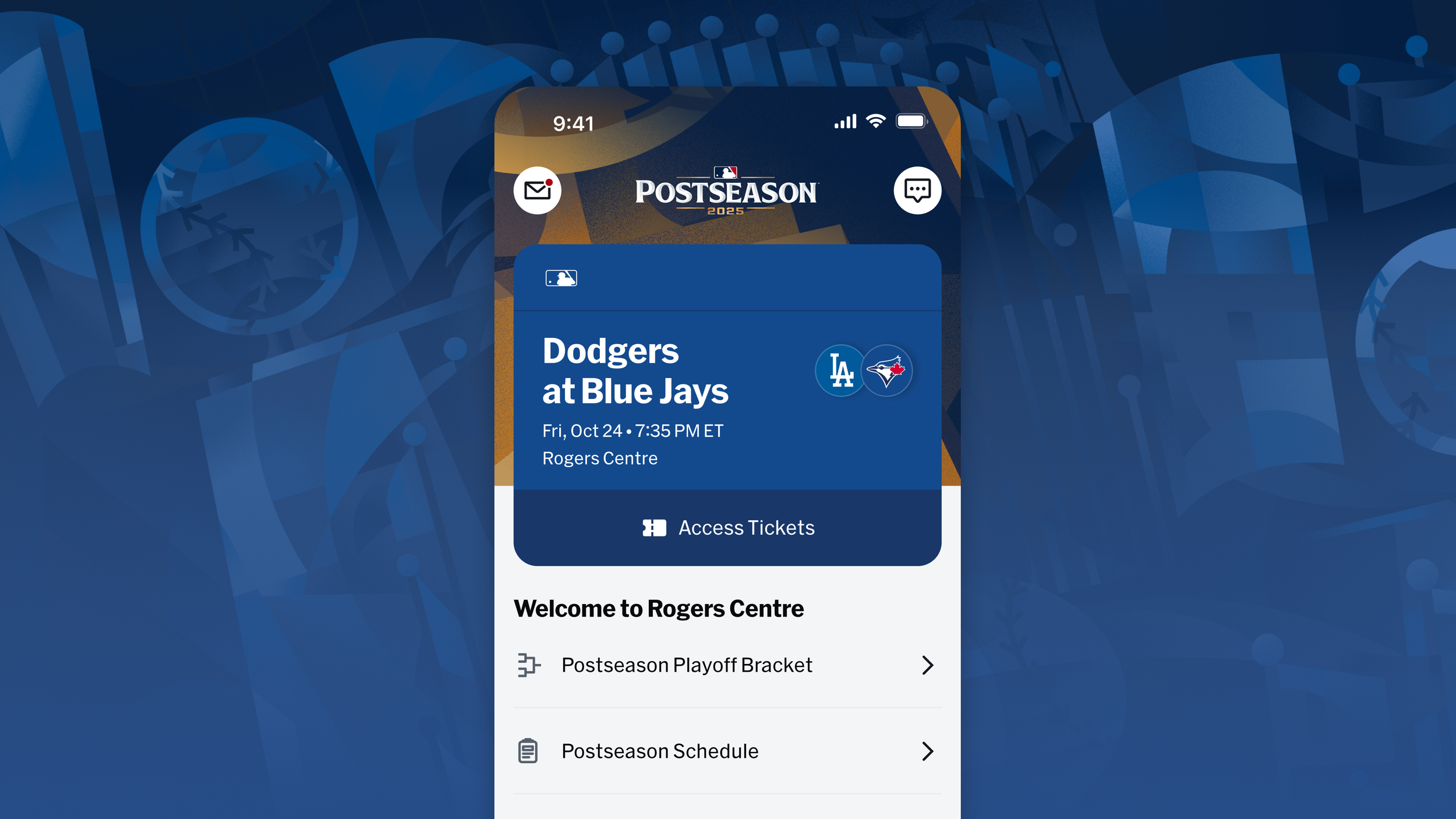
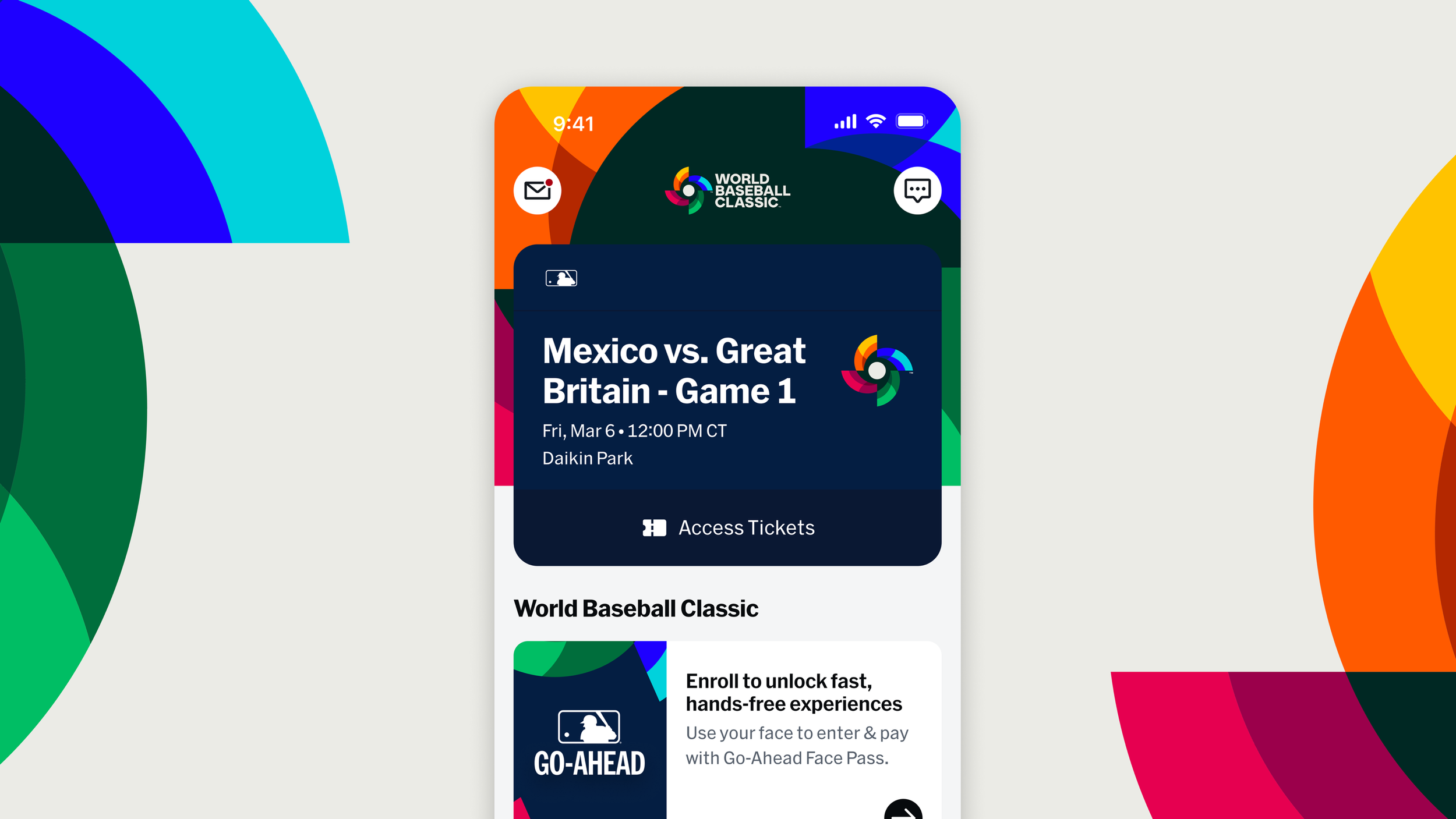
Going beyond the regular season…
Starting in Postseason 2025, we also introduced branded takeovers of the Home Tab for special MLB marquee events. These takeover moments help create a more distinct, celebratory experience for fans attending feature games.